A mobile app for pregnancy and women's health: a product whose entire information hierarchy changes depending on what week the user is in.
Industry
HealthTechPregnancy / women's health
Services
DesignMobile app UX/UI
Platform
Mobile appFigma
Status
Completed
40 weeks
a product where the home screen should not mean the same thing twice
Zoeflow: pregnancy and women's health, designed around a moving timeline.
The Challenge
An app with a moving centre
Most apps have a stable home screen. A pregnancy app does not. What matters in week eight (symptoms, early appointments, what is safe) has almost nothing in common with week thirty-four, and the user does not want to go looking for the difference.
There is also a tonal constraint that runs through everything. Pregnancy content sits close to medical information and close to anxiety at the same time. Get it too clinical and it frightens; too breezy and it stops being useful at exactly the moment someone needs it to be.
The home screen has to already know what week it is.
So the design problem was less about screens and more about sequencing what surfaces when, and what quietly recedes.
The Approach
Design the timeline, then the screens
Let the week drive the hierarchy
Content and actions were prioritised per stage rather than fixed, so the app leads with what is relevant now instead of asking the user to navigate to it.
Hold a steady tone
Warm without being twee, informative without being alarming: a register that has to survive both routine weeks and worrying ones.
Make tracking feel light
Logging and tracking designed as quick, low-effort moments, because the alternative is an app that gets abandoned in month two.
The Solution
What we designed
A stage-aware home
The primary surface reorders itself around where the user is in the journey, so the app opens on what matters rather than on a menu.
A tone that holds up on a bad day
Visual and verbal register tested against the harder moments, not just the celebratory ones, which is the failure mode of most products in this category.
Low-friction tracking
Symptom and progress logging designed for speed, keeping the data useful without making the app a chore.
The Results
What shipped
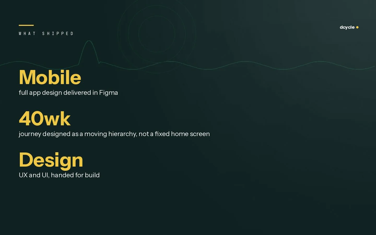
Mobilefull app design delivered in Figma
40wkjourney designed as a moving hierarchy, not a fixed home screen